THE PUBLIC THEATER
In 1994, Paula Scher was the first designer to create a new identity and promotional graphics system for The Public Theater, a program that become the turning point of identity in designs that influence much of the graphic design created for theatrical promotion and for cultural institutions in general. Based on the challenge to raise public awareness and attendance at the Public Theater along with trying to appeal to a more diverse crowd, Scher created a graphic language that reflected street typography and graffiti-like juxtapostion. In 1995, Paula Scher and her Pentagram team created promotional campaigns for The Public Theater’s production of Savion Glover’s Bring in’Da Noise, Bring in ‘Da Funk that featured the wood typefaces used throughout The Public Theater’s identity. Scher was inspired by Rob Ray Kelly’s American Wood Types and the Victorian theater's poster when she created the cacophony of disparate wood typefaces, silhouetted photographs and bright flat colors for the theater's posters and billboard. Scher limited her colors to two or three while highlighted the play’s title and theater logo that surrounded the tap artist in a typographical be-bop. The design was to appeal to a broad audience from the inner cities to the outer boroughs, especially those who hadn’t been attracted to theater. (Wikipedia)

Children's Museum
Pittsburgh, PA


New Jersey Performing Arts Center
Newark, NJ


Midtown Parking Garage
New York City
ARCHITECTURE DESIGN
Paula Scher has created many clever designs integrating typography into architectureal spaces. She works often with signage as well. She has designed work for everything from museums, to schools, to parking garages.

ALBUM COVERS
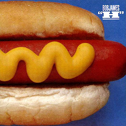
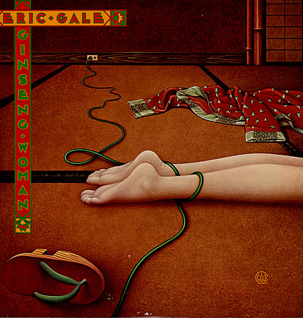
In 1972, she was hired by CBS Records to the advertising and promotions department. After two years, she left CBS Records to pursue a more creative endeavor at a competing label, Atlantic Records, where she became the art director, designing her first album covers. A year later Scher returned to CBS as an art director for the cover department. During her eight years at CBS Records, she is credited with designing as many as 150 album covers a year. Some of those iconic album cover designs are Boston (Boston), Eric Gale (Ginseng Woman), Leonard Bernstein (Poulenc Stranvinsky), Bob James (H), Bob James and Earl Klugh (One on One), Roger Dean and David Howells (The Ultimate Album Cover Album) and Jean-Pierre Rampal and Lily Laskin (Sakura: Japanese Melodies for Flute and Harp). In addition her designs were recognized with four Grammy nominations. She is also credited with reviving historical typefaces and design styles. (Wikipedia)


LOGO DESIGNS